Loading...
Searching...
No Matches
Anvil.API.NuiGroup Class Referencesealed
A group, usually with a border and some padding, holding a single element. Can scroll.
Will not advise parent of size, so you need to let it fill a span (col/row) as if it was a element.
More...
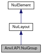
 Inheritance diagram for Anvil.API.NuiGroup:
 Collaboration diagram for Anvil.API.NuiGroup:
Public Member Functions | |
| void | SetLayout (NwPlayer player, int token, NuiLayout newLayout) |
| Sets the group layout for a specific player + window token (override/partial update). | |
Properties | |
| bool | Border = true [get, set] |
| NuiElement? | Element [get, set] |
| NuiLayout? | Layout [get, set] |
| NuiScrollbars | Scrollbars = NuiScrollbars.Auto [get, set] |
| override IEnumerable< NuiElement > | SerializedChildren [get] |
| override string | Type [get] |
 Properties inherited from Anvil.API.NuiLayout Properties inherited from Anvil.API.NuiLayout | |
| IEnumerable< NuiElement > | SerializedChildren [get] |
 Properties inherited from Anvil.API.NuiElement Properties inherited from Anvil.API.NuiElement | |
| float? | Aspect [get, set] |
| The aspect ratio (x/y) for this element. | |
| NuiProperty< string >? | DisabledTooltip [get, set] |
| Tooltips for disabled elements show on mouse hover. | |
| List< NuiDrawListItem >? | DrawList [get, set] |
| NuiProperty< bool >? | Enabled [get, set] |
| Toggles if this element is active/interactable, or disabled/greyed out. | |
| NuiProperty< bool >? | Encouraged [get, set] |
| Encouraged elements have a breathing animated glow inside of it. | |
| NuiProperty< Color >? | ForegroundColor [get, set] |
| Style the foreground color of this widget. This is dependent on the widget in question and only supports solid/full colors right now (no texture skinning). For example, labels would style their text color; progress bars would style the bar. | |
| float? | Height [get, set] |
| The height of this element, in pixels. | |
| string? | Id [get, set] |
| A unique identifier for this element. | |
| float? | Margin [get, set] |
| The margin on the widget. The margin is the spacing outside of the widget. | |
| float? | Padding [get, set] |
| The padding on the widget. The padding is the spacing inside of the widget. | |
| NuiProperty< bool >? | Scissor [get, set] |
| NuiProperty< string >? | Tooltip [get, set] |
| A tooltip to show when hovering over this element. | |
| string | Type [get] |
| NuiProperty< bool >? | Visible [get, set] |
| Toggles if this element should/should not be rendered. Invisible elements still take up layout space, and cannot be clicked through. | |
| float? | Width [get, set] |
| The width of this element, in pixels. | |
Detailed Description
A group, usually with a border and some padding, holding a single element. Can scroll.
Will not advise parent of size, so you need to let it fill a span (col/row) as if it was a element.
Member Function Documentation
◆ SetLayout()
Sets the group layout for a specific player + window token (override/partial update).
- Parameters
-
player The player with the window containing this group. token The token of the window to update. newLayout The new layout to apply to this group.
- Exceptions
-
InvalidOperationException Thrown if this group does not have an Id assigned.
The documentation for this class was generated from the following file:
- NWN.Anvil/src/main/API/Nui/Layout/NuiGroup.cs

