Loading...
Searching...
No Matches
Anvil.API.NuiElement Class Referenceabstract
A dynamic NUI element with style support. More...
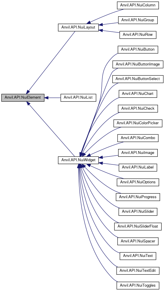
 Inheritance diagram for Anvil.API.NuiElement:
Properties | |
| float? | Aspect [get, set] |
| The aspect ratio (x/y) for this element. | |
| NuiProperty< string >? | DisabledTooltip [get, set] |
| Tooltips for disabled elements show on mouse hover. | |
| List< NuiDrawListItem >? | DrawList [get, set] |
| NuiProperty< bool >? | Enabled [get, set] |
| Toggles if this element is active/interactable, or disabled/greyed out. | |
| NuiProperty< bool >? | Encouraged [get, set] |
| Encouraged elements have a breathing animated glow inside of it. | |
| NuiProperty< Color >? | ForegroundColor [get, set] |
| Style the foreground color of this widget. This is dependent on the widget in question and only supports solid/full colors right now (no texture skinning). For example, labels would style their text color; progress bars would style the bar. | |
| float? | Height [get, set] |
| The height of this element, in pixels. | |
| string? | Id [get, set] |
| A unique identifier for this element. | |
| float? | Margin [get, set] |
| The margin on the widget. The margin is the spacing outside of the widget. | |
| float? | Padding [get, set] |
| The padding on the widget. The padding is the spacing inside of the widget. | |
| NuiProperty< bool >? | Scissor [get, set] |
| NuiProperty< string >? | Tooltip [get, set] |
| A tooltip to show when hovering over this element. | |
| string | Type [get] |
| NuiProperty< bool >? | Visible [get, set] |
| Toggles if this element should/should not be rendered. Invisible elements still take up layout space, and cannot be clicked through. | |
| float? | Width [get, set] |
| The width of this element, in pixels. | |
Detailed Description
A dynamic NUI element with style support.
The documentation for this class was generated from the following file:
- NWN.Anvil/src/main/API/Nui/NuiElement.cs
